Harbor Navy
RGB 37 · 42 · 102
Primary headings and dark sections

SOULS HARBOR BAPTIST CHURCH
Simple tools for telling our story with warmth, clarity, and consistency.
Brand guidelines · Logos, colors & typography01 · OUR IDENTITY
Use the church’s existing logo consistently. Give it room to breathe and keep every part of the artwork in its original proportion.

Keep it clear.
Use a plain, contrasting background and generous space around the logo.
Keep it intact.
Do not stretch, redraw, crop, add shadows, or apply unapproved colors to the official artwork.
This download is the current website artwork. Use an approved vector master for large signage and professional printing. The white PNG is for dark backgrounds; the full-color logo works best on white. Keep clear space at least the height of the “Baptist Church” lettering on every side. These are website assets, not new logo designs.
02 · COLOR PALETTE
Navy anchors the identity. Blue brings emphasis, teal connects us to the lakefront, and a small amount of purple, amber, or rose adds variety. Use cream and white to leave room for the message.
RGB 37 · 42 · 102
Primary headings and dark sections
RGB 40 · 104 · 200
Emphasis and key links
RGB 39 · 125 · 143
Neighborhood and secondary accents
RGB 247 · 245 · 239
Quiet section backgrounds
RGB 105 · 81 · 165
Supporting accent
RGB 154 · 99 · 17
Supporting accent
RGB 168 · 62 · 106
Supporting accent
RGB 37 · 44 · 64
Readable body text
Select a color code to copy it. These HEX values are for digital use; ask your printer for a proof before matching colors in print.
Download digital color paletteUse the service-card tints as soft backgrounds, with dark text. HEX/RGB values define the digital palette. No Pantone or CMYK match is specified; request a physical proof from your printer.
03 · TYPOGRAPHY
Serving our neighbors.
Sharing the hope of Christ.
Use Lora Regular for short, expressive headings. Italic adds a gentle second voice. Keep line lengths comfortable and avoid setting entire paragraphs in italic.
Get LoraThere’s a place for you here.
Use Nunito Sans for body copy, navigation, dates, and practical information. Regular works for paragraphs; bold gives labels and calls to action a clear hierarchy.
Get Nunito SansWebsite fallbacks: Georgia for Lora; Arial or a system sans serif for Nunito Sans.
04 · NAUTICAL STYLE
Keep the harbor theme quiet and purposeful: a historic anchor, simple Lake Michigan waves, and generous cream or white space. The church logo remains the main identifier.
A supporting visual language.
Use anchors and waves for ministry artwork or a subtle divider. Keep lines simple and colors within the church palette. Three to Thrive is ministry artwork, not a replacement church logo.
Keep the message first.
Avoid busy nautical patterns, cartoon boats, excessive rope borders, and decorative symbols on every heading. One meaningful illustration is enough.
“Which hope we have as an anchor of the soul, both sure and stedfast…”HEBREWS 6:19 · KJV
05 · PHOTOGRAPHY
Choose photographs of our congregation, ministry, church building, and neighborhood. Favor honest moments, natural color, and a clear subject.
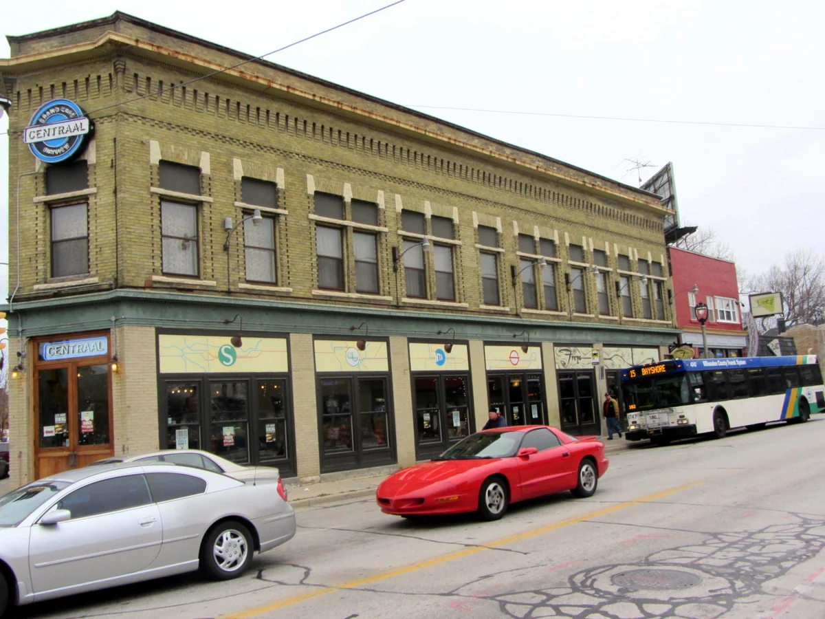
Place and character: our Milwaukee neighborhood.
Photo: David Wilson · CC BY 2.0 · Source and license
History deserves care.
Correct fading and scan damage conservatively. Preserve faces, expressions, signs, and the details that make a photograph authentic.
People deserve care.
Confirm permission before publishing identifiable people, especially children. Write accurate captions and useful alternative text.
06 · WRITING STYLE
Write as a welcoming neighbor. Use plain language, short paragraphs, and practical details that help someone take the next step.
07 · PUTTING IT TOGETHER
MILWAUKEE · WISCONSIN
Grow in your walk with Christ, put your gifts to work, and share life with others.
Plan your visit.jpg)